Still deciding on the best email marketing platform for your business?
Perhaps you’re just getting started with list building and you’re looking for a simple, cost-effective tool for the job.
Or maybe you’ve been using a service for a while and looking to change for a variety of reasons.
Either way, you want to know what’s best for you and in this post, I’ll be outlining why we switched over to Convertkit from Aweber!
Let’s get started!
Why we ditched Aweber
Aweber was the first email marketing tool I used for this website. Heck, it was the first email marketing tool I’ve used in my entire life!
At the time I was totally new to email marketing and only signed up for Aweber because it was compulsory for one of the affiliate programs I was promoting at the time. So there was no research and selection process involved in choosing an email service provider at this point.
But it worked fine for the basic autoresponder sequences I was using at the time.
A few months down the line, I wanted to introduce a little marketing automation into my follow-up sequences. And this wasn’t something Aweber could handle.
There were also a number of things I found irritating about Aweber in general like:
- The confusing and counter-intuitive user interface that’s outdated.
- The multi-subscriber rule on same email addresses (If one person subscribers more than once on your site it counts as an additional subscriber).
- Terrible sign-up forms.
- The confusing and counter-intuitive user interface that’s outdated.
- The multi-subscriber rule on same email addresses (If one person subscribers more than once on your site it counts as an additional subscriber).
- Terrible sign-up forms.
So why did I decide to make the HUGE effort to migrate everything across from Aweber to Convertkit?
If you’re already using an email marketing platform, you know that changing your provider is no joke.
It’s a lot of work.
So let’s take a look at why you should consider Convertkit for your email marketing…
What is Convertkit?
Convertkit is a little-known email marketing company that was founded by Nathan Barry in 2013.
What started as a six-month SAAS challenge has now turned into a $900k+ per month business.
They’ve rapidly grown as a company over the last few years, establishing themselves in a market that’s already crowded with competitors.
The tool is targeted towards online creators and hence is popular among bloggers, affiliate marketers and coaches/consultants.
In short, it’s a cloud-based email marketing solution that provides simple but powerful automation features.
Here’s why we decided to migrate over to the tool:
Related: If you’re also looking to find the best page builder, we compared two popular options in this post on Clickfunnels Vs Leadpages.
1. Easy peasy automations

Automation is becoming increasingly important in today’s world of email marketing.
Basic autoresponder sequences aren’t enough to communicate your messages effectively to your subscribers.
Convertkit certainly doesn’t disappoint when it comes to this.
The automation features allow you to tailor your subscriber experience based on how they respond to your content.
Convertkit automations have two parts.
The first is called rules:
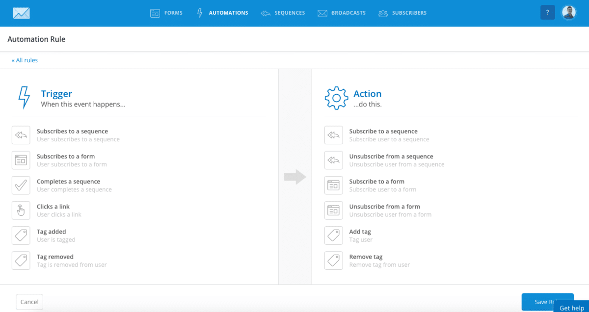
Rules work based on two things — “triggers” and “actions”.
In the image above, anything listed on the left can be used to trigger things on the right.
For example, I could add a Rule that automatically subscribes someone to a different list if they click on a link in one of my emails — or add a tag based on where they’ve signed up on my site, allowing me to share more relevant content with them further down the line.
It’s a super smooth way to tailor your messages for your subscribers using “if this then that” logic to keep things simple and straight-forward.
2. Visual automations
Following on from Rules, we have something called Visual Automations. This feature makes life so much easier when setting up anything that goes beyond basic rules.
Why?
Because rules can quickly become confusing when you’re dealing with multiple sequences.
I’ve only set-up a few of them in my account and things are already getting messy…
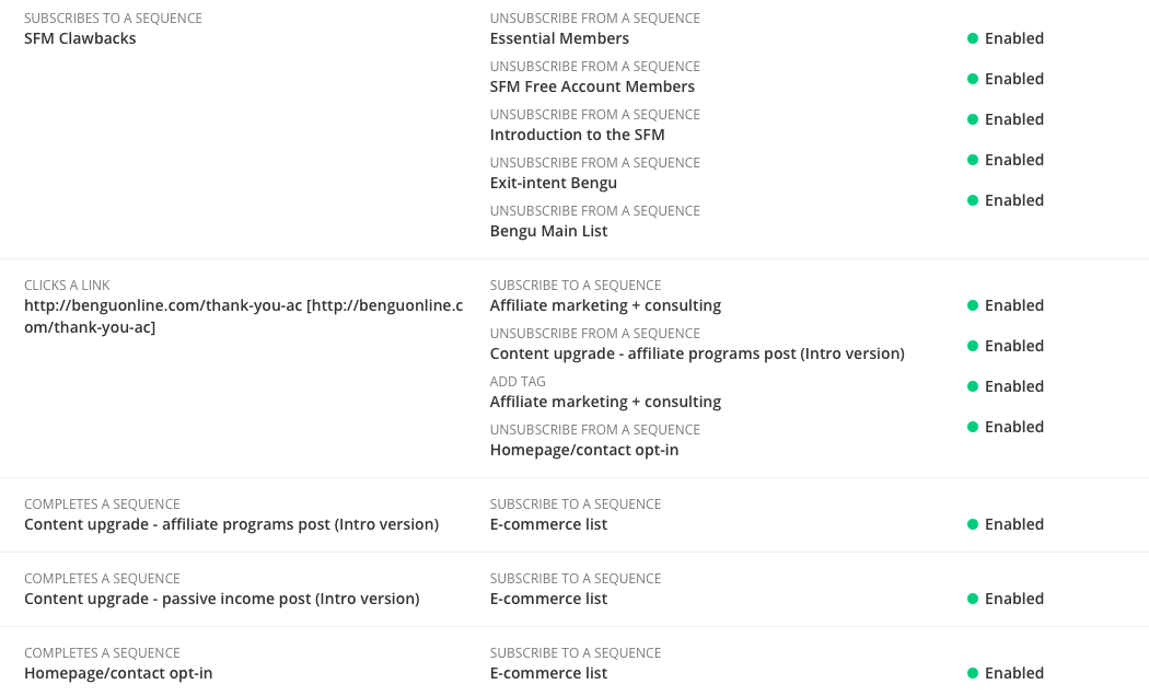
With visual automations, you can map out your subscriber’s journey from start to finish using a flowchart diagram.
So instead of looking at a long list of confusing rules, you get to see a visual representation of your subscriber journey.
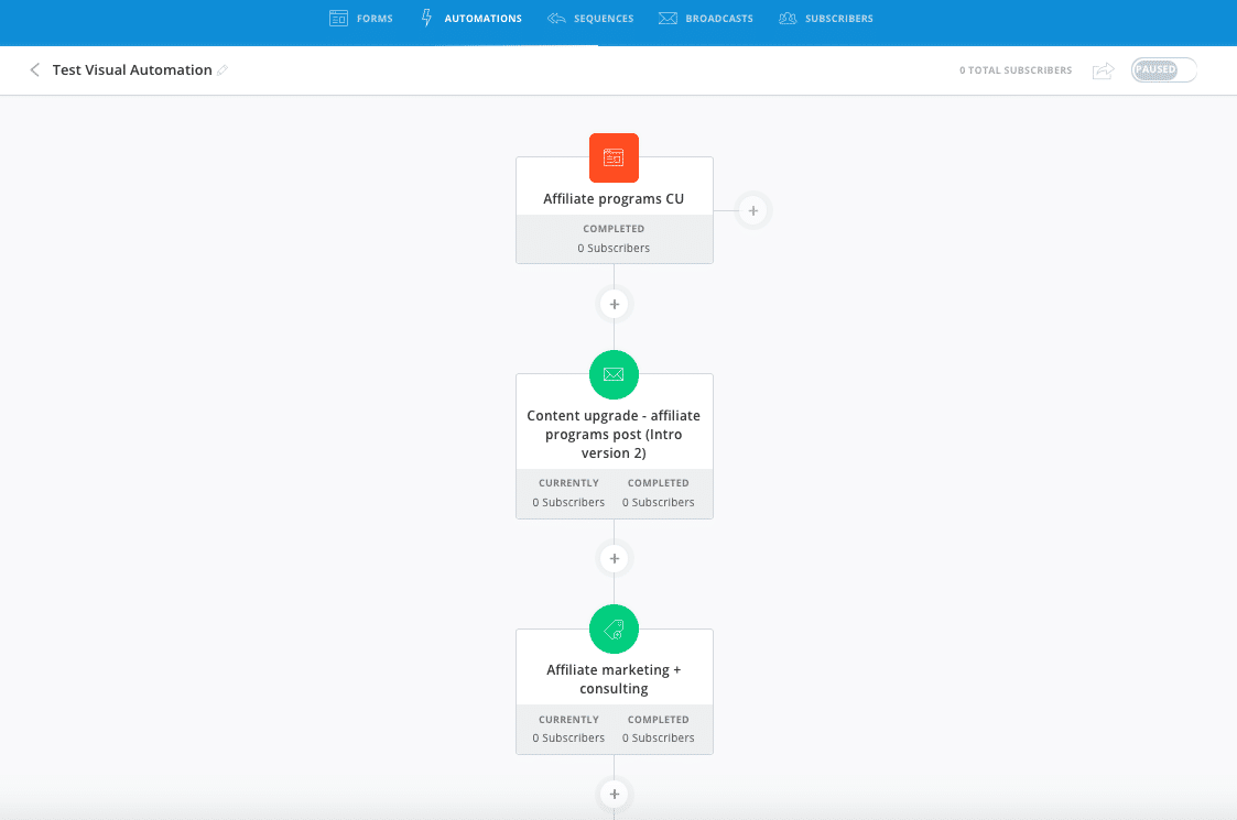
In the above screenshot, I’ve set up an ultra-simple automation that adds a subscriber to a sequence and tags them after joining my “affiliate programs CU” form on the blog.
This took me around 20 seconds to create.
Can you see how simple this is?
Convertkit do a great job at keeping things simple and easy to grasp so you won’t get bogged down with technical hurdles.
3. Tags
Converkit is a subscriber-centric email marketing platform, so you only ever have one list of subscribers.
This is great because you only pay for each subscriber once, regardless of the number of times they sign-up through your website (unlike many other platforms).
But how do you keep this one giant list of people from turning into a huge generic mess?
Tags, of course!
Tags allow you to customise your subscriber experience based on the actions they take.
For example:
You can use something called “link triggers” to add a tag when a subscriber clicks on a link in your email, or when they make a purchase of your product.
Tags can be added to existing subscribers or to entirely new ones as soon as someone signs up to your list.
Something I particularly like about the tag feature is the ability to create conditional email content in both sequences and email broadcasts.
This means you can send the same email with different messages based on the tags they have assigned to them.
Let’s say I want to include a special offer to a tagged group of subscribers on my list.
Here’s how it would look:
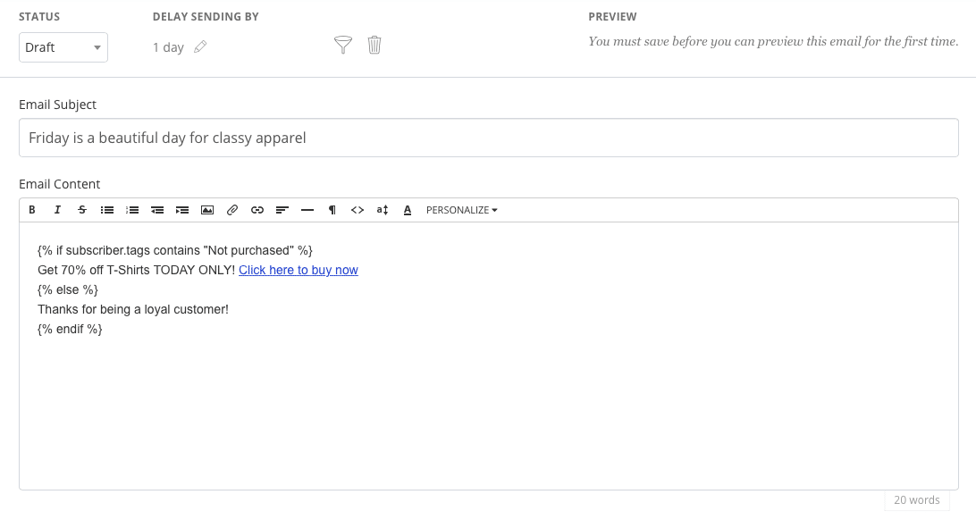
This little piece of code differentiates between messages based on whether a subscriber is tagged with “Not purchased” or not.
If someone hasn’t purchased from me yet, they’ll get a special 70% off deal in my (totally fictitious) store — but if they’re already a customer, they get a “thanks for being a loyal customer” message instead.
Pretty cool, right?!
This gives you more flexibility in communicating the message you want your subscribers to hear.
4. Custom content to existing subscribers

So what happens when subscribers come back to your site to check out your latest piece?
Most websites display the same opt-in forms to existing subscribers.
But with Convertkit, you can display custom content to people that have already signed up to your list.
This means you won’t be wasting valuable space showing the same old sign-up forms to your existing leads…
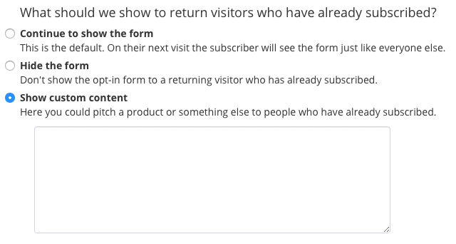
You also have the option of hiding the form instead of displaying custom content — all in the name of improved subscriber experience!
5. Simple subscriber reporting
Converkit’s reporting features are very simple, maybe a little too simple for some.
But I like the dashboard reports that you see when you login…
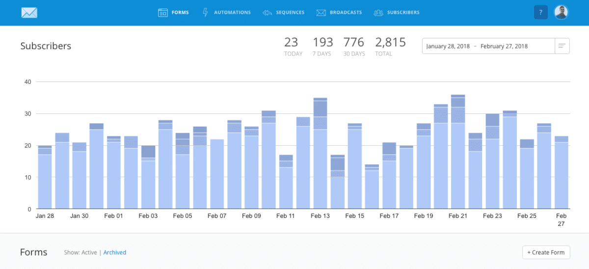
This provides great insight into how your campaigns are performing on a daily basis. You also get a nice breakdown based on where someone has signed up on your site — illustrated by the various shades of blue on each bar.
Sequence reporting is a little on the thin side, you can’t go much further than simple open and click rate data when drilling into your campaigns…
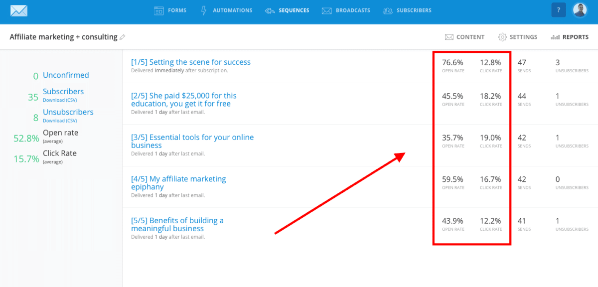
But for my needs, I’m happy with what’s on offer at the moment. If you’re looking for advanced reporting features, Convertkit probably isn’t the best option for you.
6. Advanced email filtering
Advanced email filtering further empowers you with the ability to customise your message.
You can use this feature to exclude subscribers from receiving specific emails based on things like tags, sequences and forms.
Here’s what it looks like:
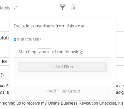
I’ve used this filtering option to stop sending the same messages to people twice if they’ve signed up to a similar list!
You can also use it for filtering out cold subscribers.
These are people that haven’t opened or clicked an email in the last 90 days (they’re specifically segmented for you in Convertkit).
I can imagine this being useful if you wanted to segment cold subscribers into a separate list where you could follow up with them to rekindle the relationship.
7. Full popup support
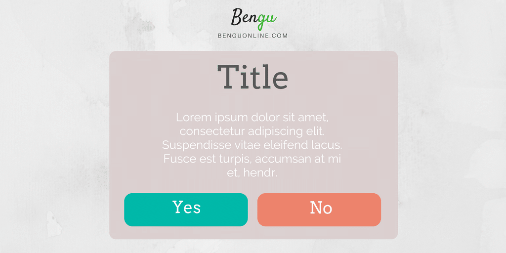
If you decide to use the Convertkit sign-up forms on your site, you can enjoy full popup form integrations.
You know the popups that come up right before you’re about to leave a website?
Yeah, the annoying ones — they actually work!
Converkit allows you to set-up these forms in various ways for your website.
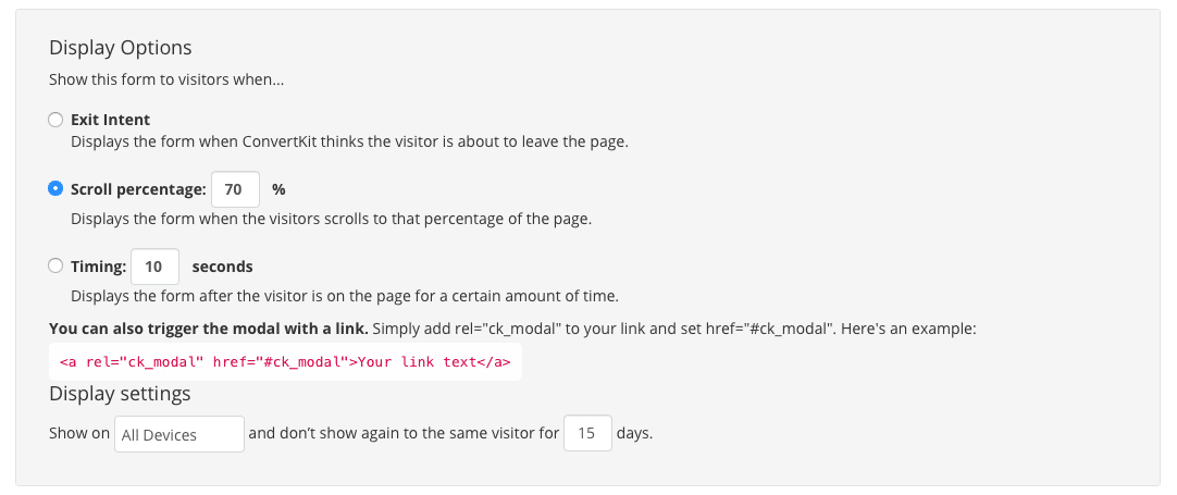
You can set these forms to appear right before someone is about to leave, after they’ve scrolled through a certain percentage of the page, or after clicking a link.
Here’s what the options look like:
This totally eliminates the need for a paid tool like Optin Monster to handle all your popups.
8. Subscriber interaction history

This certainly isn’t a feature unique to Convertkit, but it’s something I’ve really come to like after using the tool for a few months.
When looking through your subscribers, you’re able to go into each one and get a detailed summary of email activity.
So you can see which emails your subscriber has been sent as well as which ones they’ve opened and clicked.
You can also see any tags, sequences and segments subscribers are added to.
Here’s what it looks like:
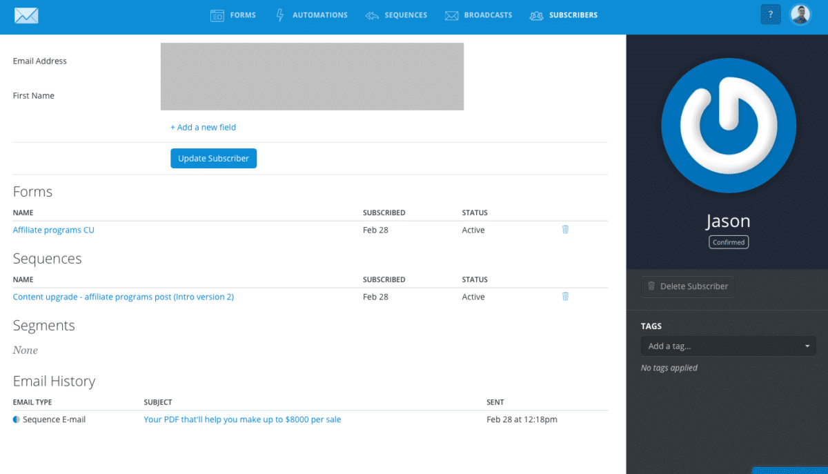
I’ve used this more for troubleshooting than anything else — often times I’ve had people emailing about duplicate messages and this allows me to get to the root of the problem pretty quickly.
This is a feature that Aweber does not have at the moment.
9. Segments instead of lists

If you’ve used email marketing software, you’re probably familiar with the term “list” that’s used to identify a group of subscribers you’ve collected.
But Convertkit doesn’t use lists to sort subscribers.
Why?
Because traditional “lists” are awfully inflexible with most email service providers — you’ve also got the issue of duplicate emails that cause a variety of problems (like paying extra money for the same subscribers).
Instead of creating a list on Convertkit, you create a Segment.
A segment is an efficient way of grouping your subscribers based on their interests.
Forms, tags and sequences all fall underneath a segment (if you choose to create one).
Think of a segment as a folder that neatly groups your subscribers into various categories.
This is powerful because you can organise your list in a way that’s WAY more efficient.
But how are segments different from tags?
Tags organise your subscribers — segments organise your tags (plus forms and sequences).
Take a look at this file binder:
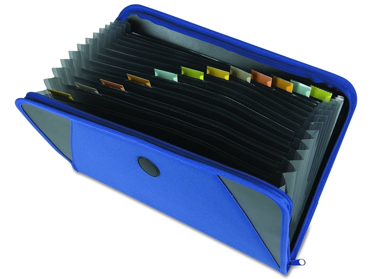
The tags, in this case, would be the little multi-coloured labels, while the binder itself would be the segment.
Your website could have multiple binders belonging to various topics such as marketing, product development and sales.
10. Resending to unopens
Resending a broadcast to people that haven’t opened your previous message is a proven way to get more eyeballs on your emails.
Doing this in Aweber was a huge pain in the bottom.
But with Convertkit, it’s as simple as pressing a button…
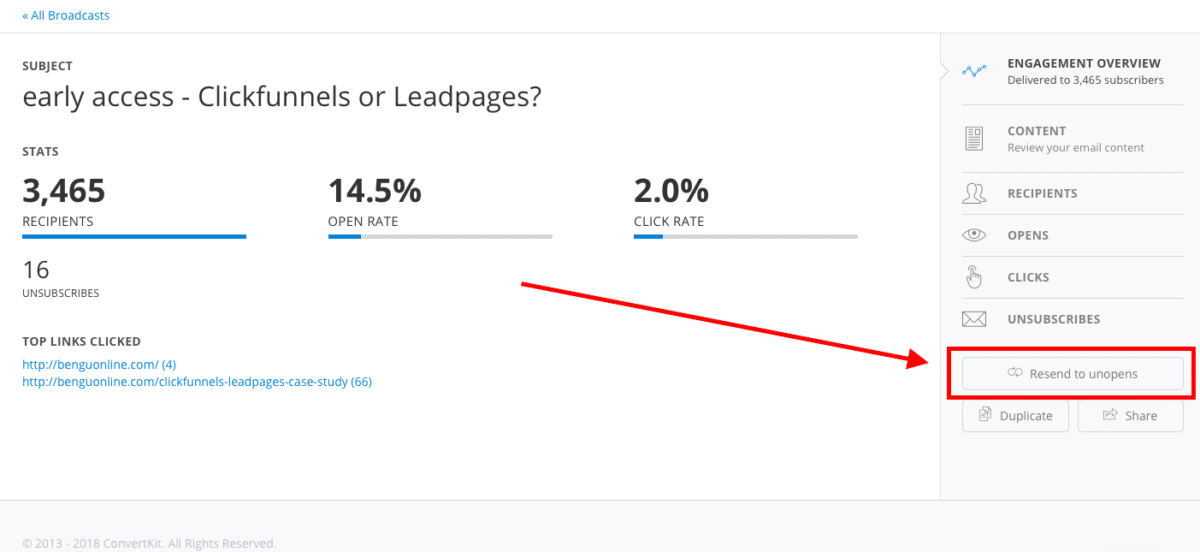
Again, this is one of the more simple features but these little things all add up in terms of my satisfaction with the tool.
What sucks about Convertkit
It’s not all sunshine and rainbows with Convertkit — there’s definitely room for improvement in a few areas.
One of the reasons Convertkit has enjoyed rapid growth is because it is ultra-simple and straightforward to use.
But this is also why it’s not suited for some of you. There are a number of areas where this software falls short on functionality. For example, there is no email verification process to verify an email list you’ve imported.
Here’s what I’ve discovered through using the tool:
Lack of template library
Most email marketing tools have a template library where you can choose from a selection of templates, based on the type of message you’d like to send.
For Convertkit, you get none.
That’s zero. Nada.
Most bloggers don’t mind this because plain text emails have been proven to work way better than their HTML counterparts. And from personal experience, I’ve only ever used plain-text emails to communicate with subscribers.
But what if you’re running an e-commerce business? You’ll probably want to use some form of template to email your subscribers/customers.
I can only assume the lack of templates is due to Convertkit being so focused on bloggers.
Related Content: Looking for ways to build your e-commerce business list? — Check out this piece on e-commerce list building fundamentals
Lack of timezone flexiblity
This one really gets on my nerves! Such a simple feature that can make a huge difference to email open rates.
So Converkit doesn’t allow you to set location-based sending times for email sequences.
Why?
I have no idea!
Instead, you’re limited to one timezone per email sequence.
The majority of subscribers from this site come from the US, and one of the best times to email people is roughly around 11 AM (on most weekdays).
But because Convertkit only has one timezone setting, I’ve had to set the time to 11 AM EST — which means all you wonderful people on the west coast get the same message super early in the morning.
Basic email editor features
The email editor in Convertkit is a little too basic.
Sure, you can change headings, add pictures and upload attachments, but you can’t change the font.
Seriously.
You can’t change the font style!
Here’s what the email editor looks like:
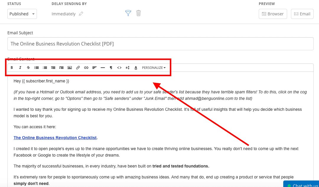
You’re not getting more than the basics here for sure.
But in line the lack of template support, Convertkit looks to be super focused on people that don’t use a lot of HTML elements in their emails.
Again, keeping things super simple.
Having said that, I use pictures, GIF’s, attachments and headings without any problems.
My only minor gripe is the lack of font selection!
Final words
Convertkit certainly isn’t a perfect email marketing solution. If you’re looking for advanced marketing automation, you won’t find it here.
But if you’re looking for an email marketing tool that can help you deliver the right message, to the right people, whilst also maintaining simple, effortless usability — Convertkit does a fantastic job.
I’ve had a great experience using the tool so far and I’m sure you will too!

I’m a London-born lover of technology, obsessed with online business, passive income and the digital economy. I love learning, researching and curating the most valuable resources to save you time, money and help you discover the truth on what it actually takes to achieve your goals.
Hello Ahmad!
Happy New Year to you and yours!
I found you through another site while searching for Convertkit. I went to their site and tried to contact them about an affiliate program, like it shared with me from: https://benguonline.com/high-paying-affiliate-programs, where I found out about you.
Not sure what is happening yet when at the site for Convertkit it didn’t seem to matter what I clicked on nothing would happen.
Do you have any insight on this and how to reach out to them?
Thank You!
Daryl Zane Wade
[email protected]
Hi Daryl,
Thanks for your comment. The Convertkit affiliate program can be found through this link — https://convertkit.com/affiliate
You can sign up for the affiliate program from that link. Once approved, you can start promoting immediately and you’ll be sent information about logging in to your affiliate dashboard.
Hope this helps